
Stop looking at the benchmark scores. I’ve spent enough hours staring at frame-rate counters and ray-tracing toggles to know that a game can look “next-gen” and still be an absolute eyesore. Most reviewers get blinded by high-res textures and lighting tech, but they completely fail at explaining how to judge art direction separately from graphics. If you’re just chasing more polygons and better shadows, you’re missing the point. I’ve seen indie titles with a fraction of the budget look more cohesive and striking than $200 million AAA titles that feel like a cluttered, soulless mess of shiny surfaces.
I’m not here to give you a lecture on color theory or technical rendering pipelines. I’m here to give you a framework that actually works when you’re looking at a trailer or playing a demo. I’ll show you how to spot a cohesive visual identity versus a collection of expensive assets, and why a consistent low-fi aesthetic will always beat a polished, directionless disaster. No hype, no fluff—just the specific things you need to look for so you don’t waste your money on a game that’s all polish and no soul.
Table of Contents
Visual Storytelling vs Graphic Execution Does the World Actually Mean Anyth

High-fidelity textures are just math, and I’m tired of people mistaking a high polygon count for actual soul. You can have a game that looks like a tech demo but feels like a sterile hospital ward because there’s zero visual storytelling vs graphic execution happening. If every room in a dungeon looks like a generic asset flip just because the lighting engine is Ray Tracing enabled, the game has failed. I don’t care if the shadows are physically accurate if they aren’t telling me why this place is ruined or who lived here.
Real art direction is about the intent behind the clutter. When I’m playing, I want to see a consistent visual language development where the architecture and the color palette actually communicate the stakes. A well-designed world uses shape language and color theory to guide my eyes toward an objective or signal danger before a single UI element pops up. If the graphics are pushing 4K but I still feel lost because the environment has no cohesive logic, then the technical design has completely steamrolled the creative vision.
Creative Vision vs Technical Design Why High Res Cant Save Bad Choices
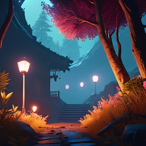
You can throw every ray-tracing lumen and 4K texture pack at a game, but it won’t fix a fundamental lack of creative vision vs technical design. I’ve seen indie titles with a fraction of the budget of a AAA blockbuster look better because they actually understood aesthetic decision making. They knew where to place the light to guide your eye to the objective, rather than just making everything look “shiny.” When a developer prioritizes technical fidelity over a coherent look, you end up with a game that looks like a tech demo—impressive for ten minutes, then utterly exhausting to look at.
A high polygon count is just math; it isn’t a style. If the developers haven’t established a clear visual language development phase, the world feels like a collection of assets rather than a lived-in space. You’ll see a hyper-realistic character model standing in a world that uses stylized, low-poly environments, and the friction is immediate. It breaks the immersion every single time. If the art direction doesn’t dictate how the tech is used, you’re just looking at expensive, uncoordinated noise.
Five Ways to Stop Getting Fooled by High Frame Rates
- Look at the silhouettes, not the shadows. If you can’t tell a boss apart from the background when the lighting goes to hell, the art direction has failed, no matter how many ray-traced reflections are bouncing off the floor.
- Check for a cohesive color palette instead of just “vibrancy.” A game can have 4K textures and a billion colors, but if the palette doesn’t guide your eye to where the gameplay actually happens, it’s just visual noise.
- Ignore the polygon count and look for intentionality. I don’t care if a rock looks hyper-realistic; I care if that rock looks like it belongs in a world built on Norse mythology rather than a random asset flip.
- Test the “screenshot rule.” If you strip away the motion blur and the high-end lighting effects, does the composition still hold up? If the scene looks like a mess of grey sludge without the shaders doing the heavy lifting, the art direction is weak.
- Evaluate how the environment communicates mechanics. Good art direction tells you where you can climb, where the danger is, and where the path lies through shape language and contrast, not just by throwing more resolution at the camera.
The Bottom Line
Stop equating polygon counts with quality; a game with low-res textures can have a cohesive, intentional art direction that makes a high-fidelity tech demo look like a hollow mess.
If you can’t tell what a room is for or why a character looks the way they do without reading a tooltip, the art direction has failed, regardless of how many ray-tracing features are enabled.
Look for the “why” behind the visuals—if every asset serves the world-building and the gameplay loop, the art direction is working; if it’s just eye candy meant to hide a lack of soul, it’s just expensive graphics.
Stop Chasing the Spec Sheet
Look, at the end of the day, stop letting marketing teams trick you into thinking a higher frame rate or 4K textures equals a better game. If the art direction is garbage, all the ray-tracing in the world is just going to show you a high-resolution version of a boring, soulless world. You have to separate the technical capability of the hardware from the intentionality of the designers. If you can’t tell where a level ends and a loading screen begins because the visual language is consistent, that’s art direction. If you’re just staring at a screen because the lighting looks “real” but you have no idea where you’re supposed to go or why this place exists, you’re just looking at expensive math.
Next time you’re scrolling through a trailer, ask yourself if the game would still work if it were rendered in low-poly PS1 style. If the answer is yes, because the silhouettes, colors, and mood are strong enough to carry the weight, then you’ve found something worth playing. Don’t settle for games that are just technically impressive but visually hollow. I’d much rather spend a hundred hours in a world that has a clear, cohesive identity than a single minute in a photorealistic sandbox that feels like nothing at all. Find the vision, not just the resolution.